Inside the Emergency Department
2026
Infographic Spread
Created using Procreate, Adobe Illustrator, and Tableau Desktop
Client: University of Toronto IMS Magazine Winter 2026 Issue, Bea Acheson (Writer)
Audience: Institute of Medical Science (IMS) graduate students, researchers, and clinicians
Format: Two-page magazine spread
Project Description
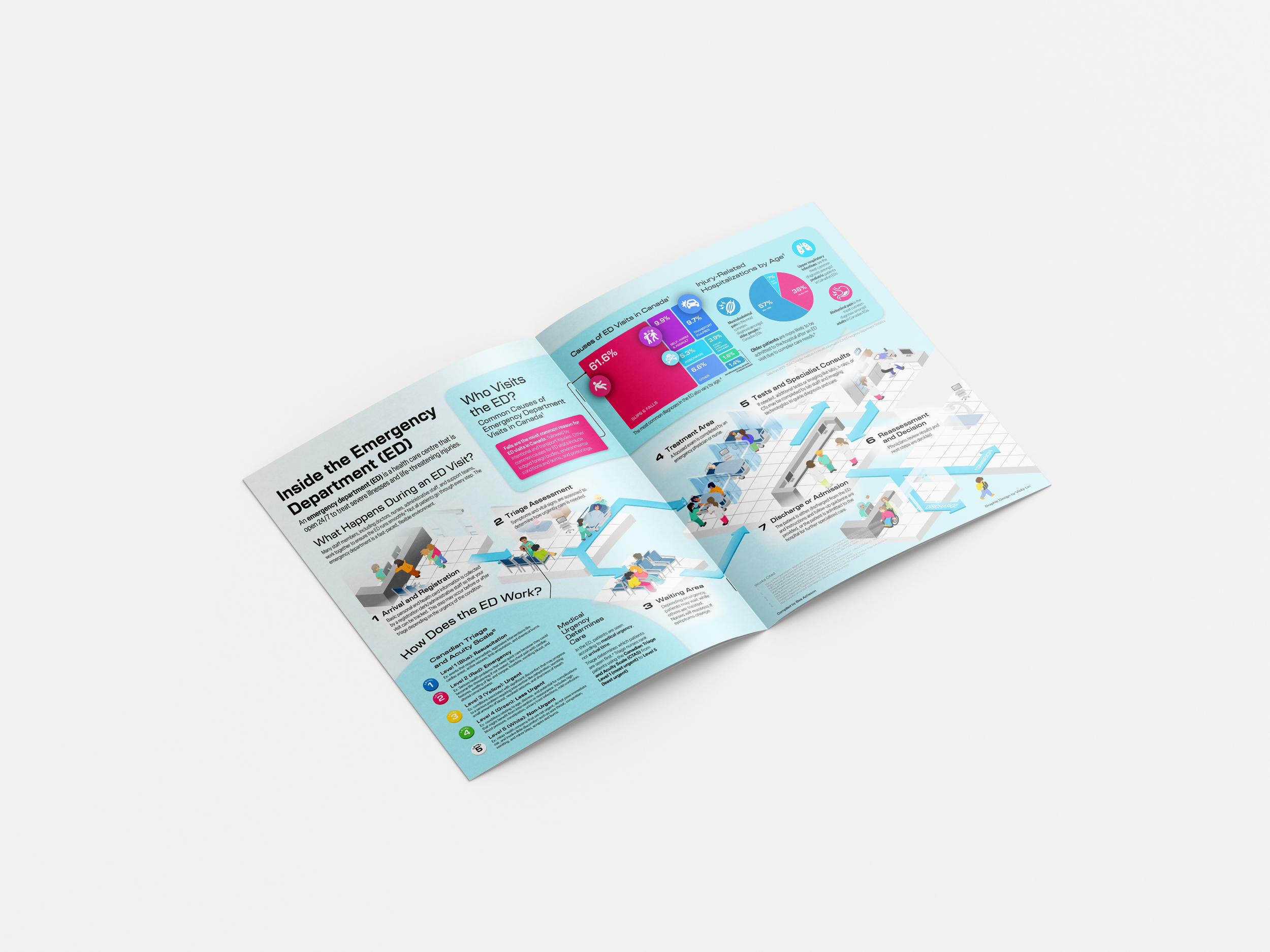
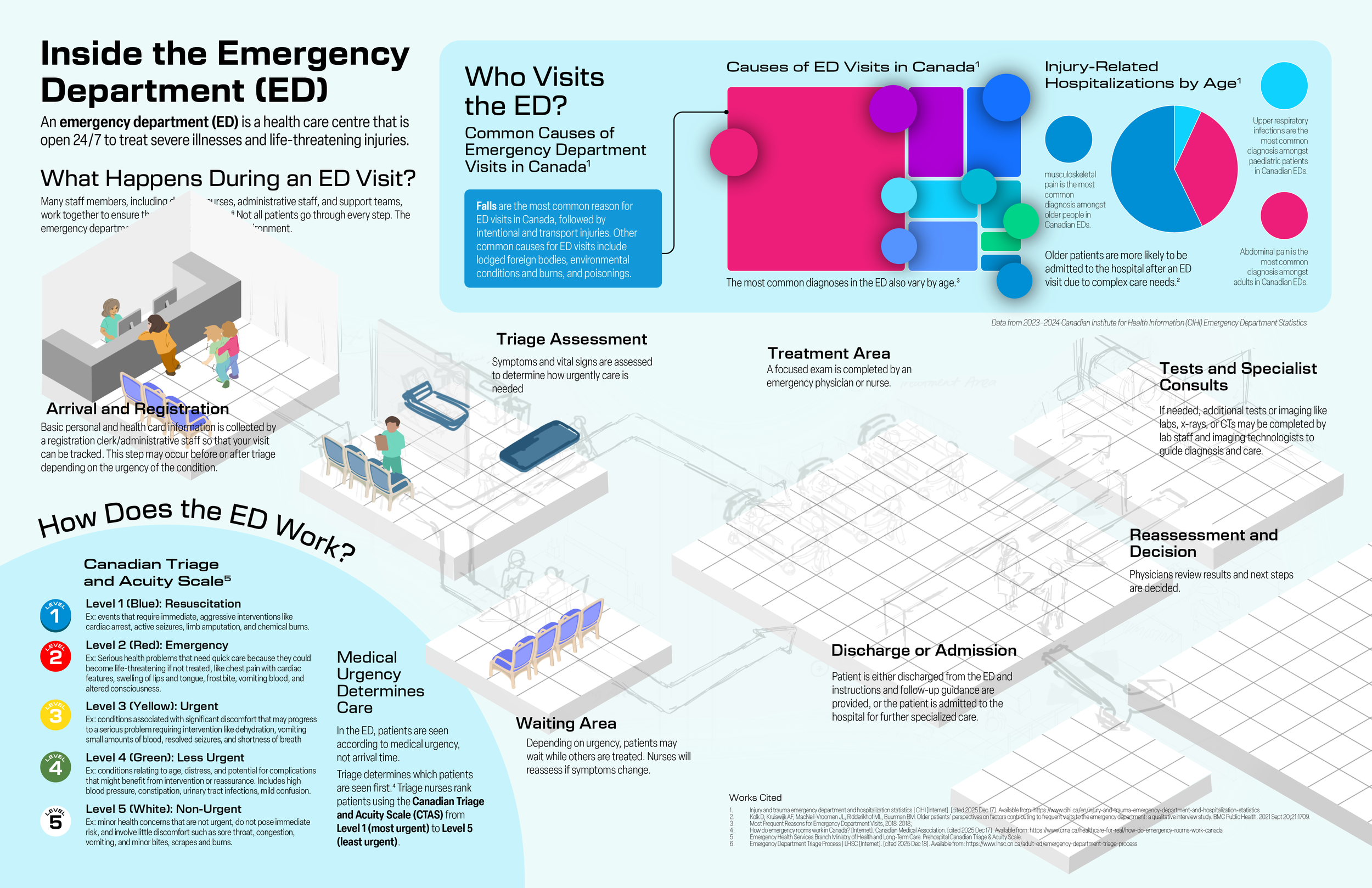
Emergency departments involve many interconnected processes and healthcare roles which can make it difficult for patients to understand how care is delivered and why wait times may occur.
In collaboration with IMS Magazine writer Bea Acheson, this two-page infographic magazine spread describes how a typical Canadian emergency department operates while highlighting common causes of hospitalization across different demographics.
Overall, this infographic answers the question, how does an emergency department work?
Goals & Objectives
This project aims to demystify how a typical Canadian emergency department works through a patient-oriented perspective. It outlines the general treatment pathway to help patients better understand what their care experience may look like once they enter the ED, and how the Canadian Triage and Acuity System (CTAS) works to prioritize conditions based on severity.
A data visualization component highlights the most common causes of injury leading to hospitalization, and illustrates how hospitalization trends vary across different age groups. By placing individual patient experiences within broader population-level trends, this visualization helps contextualize the types of conditions emergency departments frequently manage and why certain cases may be prioritized in care delivery.
Design Approach & Research
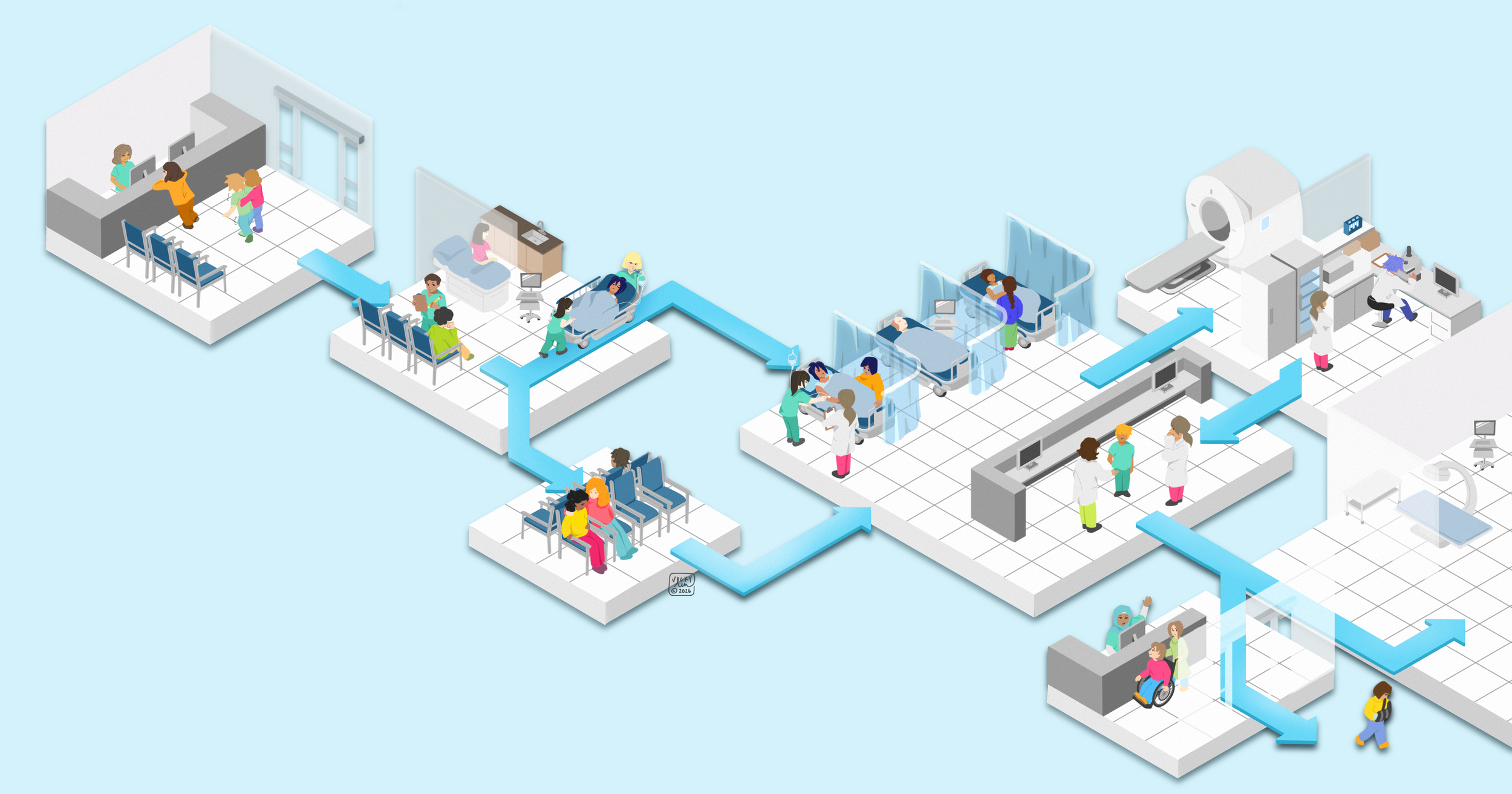
The main challenge of this illustration was to figure out a way to guide readers through the emergency department (ED) experience in a clear, logical sequence to help readers understand how patients move through the system.
This was solved using a patient journey flow map which supplementary information could be structured around. As such, supporting information like the CTAS explainer and statistical insights are presented in secondary panels to provide further context to this subject without interrupting the narrative flow. Lastly, icons and graphical elements were incorporated to help readers quickly interpret key information.
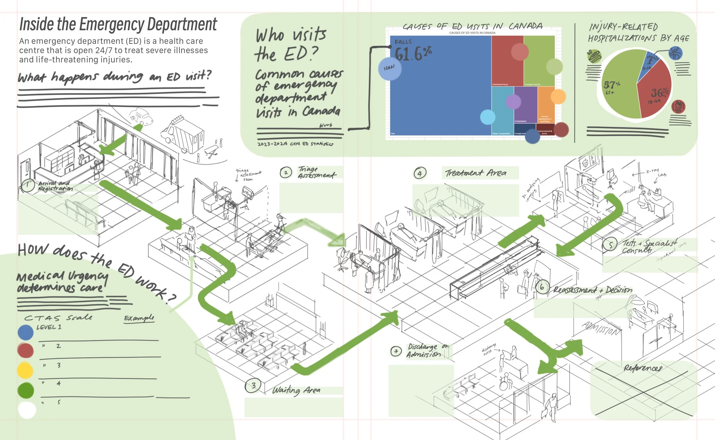
Initial concept sketch based on the design approach discussed with the writer
Visual Direction
Inspired by 3D navigational maps, the infographic is structured around these various steps and the main hero illustration draws from real hospital floor plans. Using research into ED layouts to inform the overall composition, each stage of care is represented as a snapshot of the environment the patient encounters.
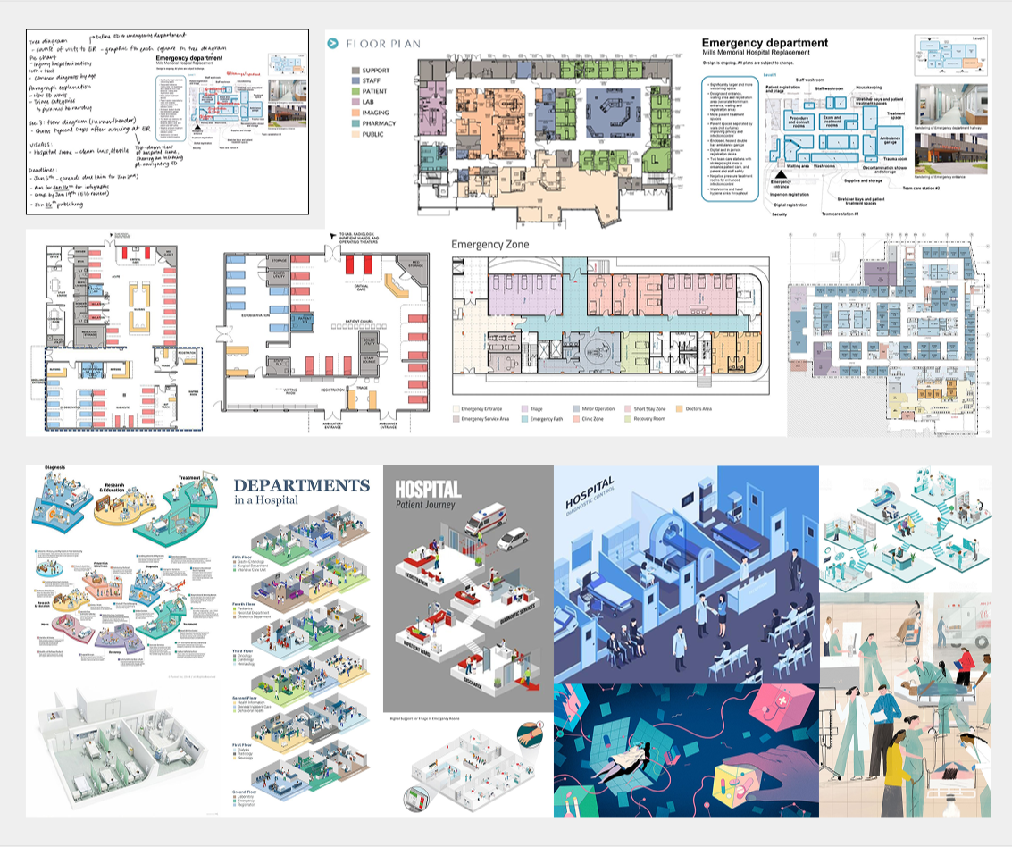
Reference Images
Each step is illustrated as an isometric platform where patients and healthcare staff interact to reflect the dynamics of a real hospital environment. This approach also highlights the various ED professionals who work together to ensure patients receive appropriate care. At the same time, I opted for a simpler colour-blocking style to illustrate the figures shown to create a more personable and friendly design.
To guide the viewer’s eye through the sequence, each platform is connected by blue arrows that indicate the progression from one stage to the next. This structure establishes a clear visual hierarchy while reinforcing the narrative flow of the patient journey. One advantage of this modular design is its flexibility. Additional information can be easily integrated into relevant steps. The arrow system also allows the diagram to show branching pathways, illustrating how patient journeys in the ED are often non-linear depending on diagnosis and treatment outcomes.
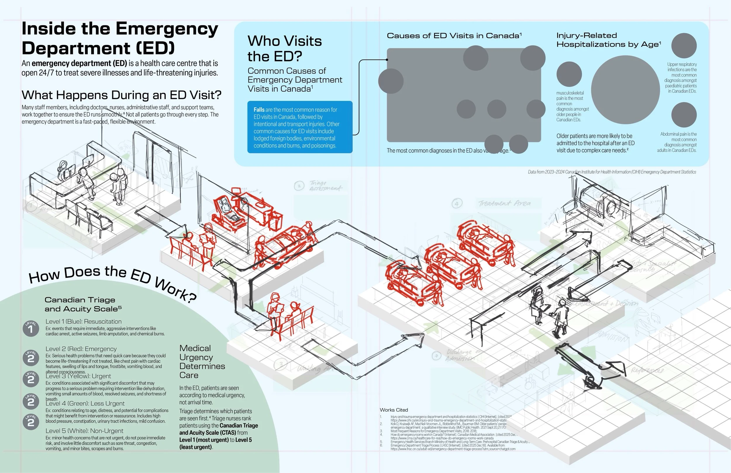
Preliminary sketch of the hero illustration and graphic design layout in Illustrator.
Refining the hero image sketch.