Health in the Margins
2025
Editorial Magazine Cover
Created using Adobe Photoshop, InDesign, and Procreate
Client: University of Toronto IMS Magazine
Audience: General audience
Format: Magazine publication cover
Full cover spread
How are different communities treated by the healthcare system?
The Fall 2025 Issue of the IMS Magazine titled Health in the Margins explores current challenges amongst Canadian and global healthcare systems, and how they impact different marginalized or underserved communities through an intersectional lens. This issue also highlights how overlooked inequalities create barriers to equitable healthcare amongst vulnerable populations, while highlighting the efforts of current IMS faculty breaking barriers within this subject.
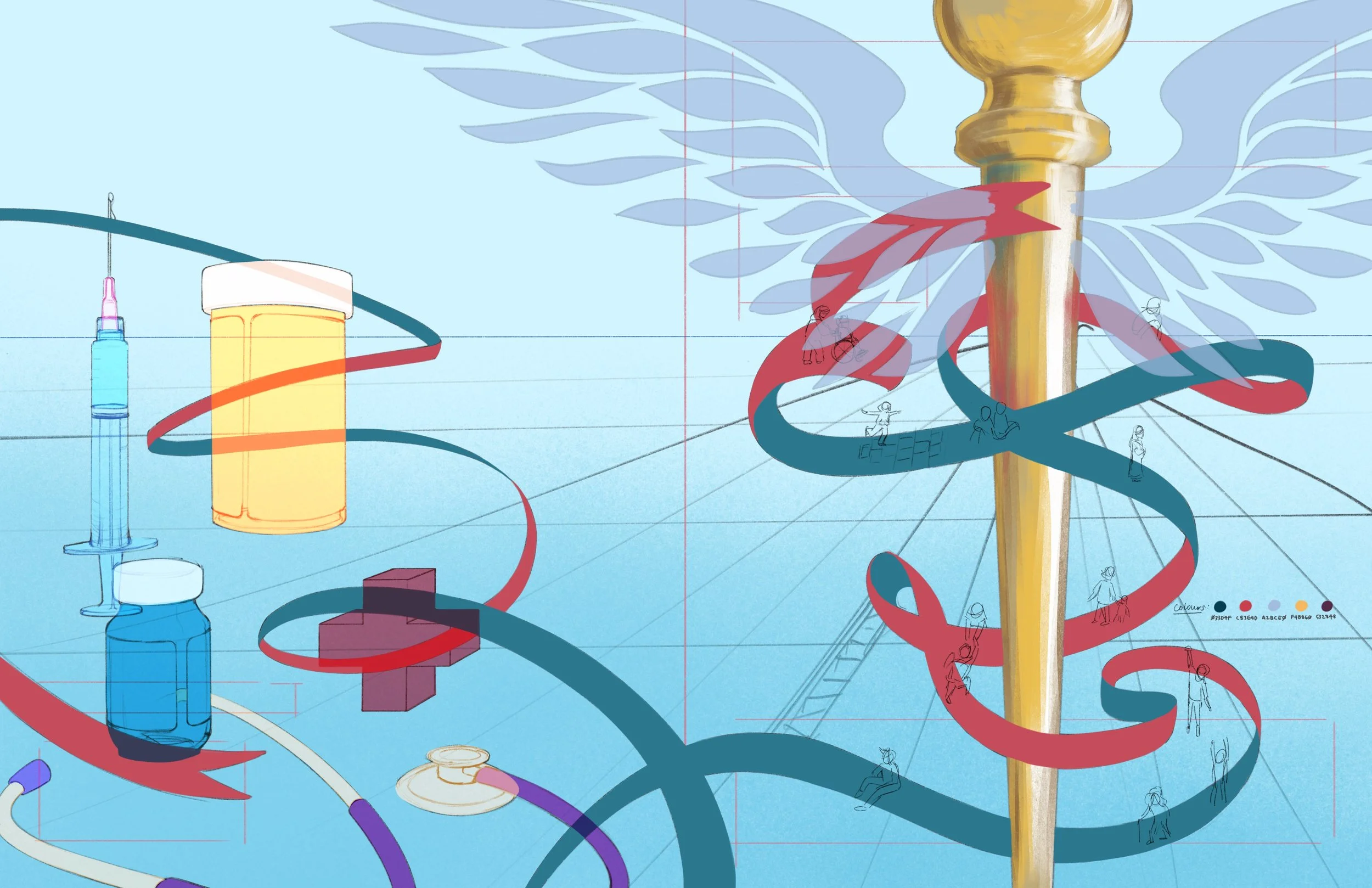
For the cover illustration, I aimed to visually capture these themes by reinterpreting familiar medical iconography as a metaphor for the varied ways individuals experience and navigate healthcare systems.
By emphasizing the visual storytelling aspect through this playful graphic style, my goal was to reflect the complexities of access, representation, and care in a friendly and accessible manner while reinforcing the issue’s focus on health equity and social inclusion.
Concept Design
Step 1. Dissecting “Health in the Margins”
How do we illustrate an abstract concept like “Health in the Margins”?
While consulting with the editors of this issue to determine the visual direction of the cover, I noted the main themes at the forefront of this publication. These included:
Barriers to equitable healthcare access
Examining systemic barriers in healthcare institutions
Social determinants of health
Health advocacy
These terms were then used to guide the development of thumbnail sketches.
Step 2. Translating themes into visual concepts
I explored various visual metaphors and imageries during the thumbnail phase to communicate this subject in diverse ways.
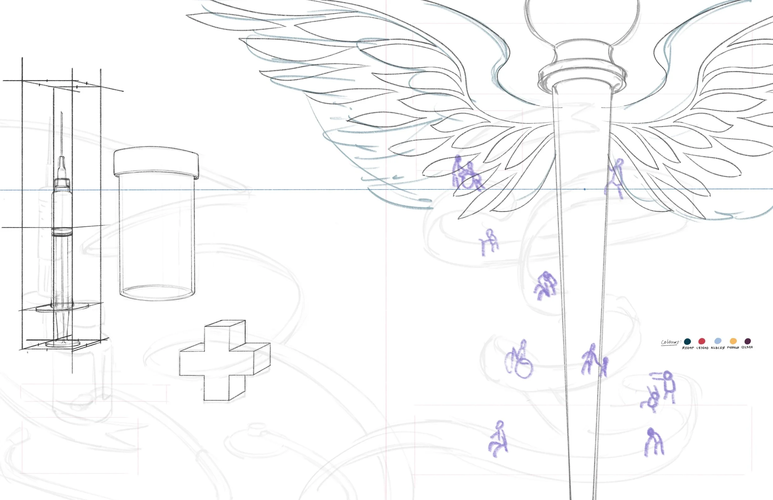
I wanted to encapsulate the overarching message in the design which was that different individuals interact with healthcare differently. I sought to emphasize this humanistic approach by including human figures throughout each composition to symbolize this theme.
With that as the visual throughline, I presented three thumbnail designs to the editors: Caduceus, Navigating the Waters of Healthcare, and Tearing Down Barriers.
Step 3. Refining the concept sketch
We proceeded with the Caduceus concept for the cover design after each thumbnail was carefully examined by the editors.
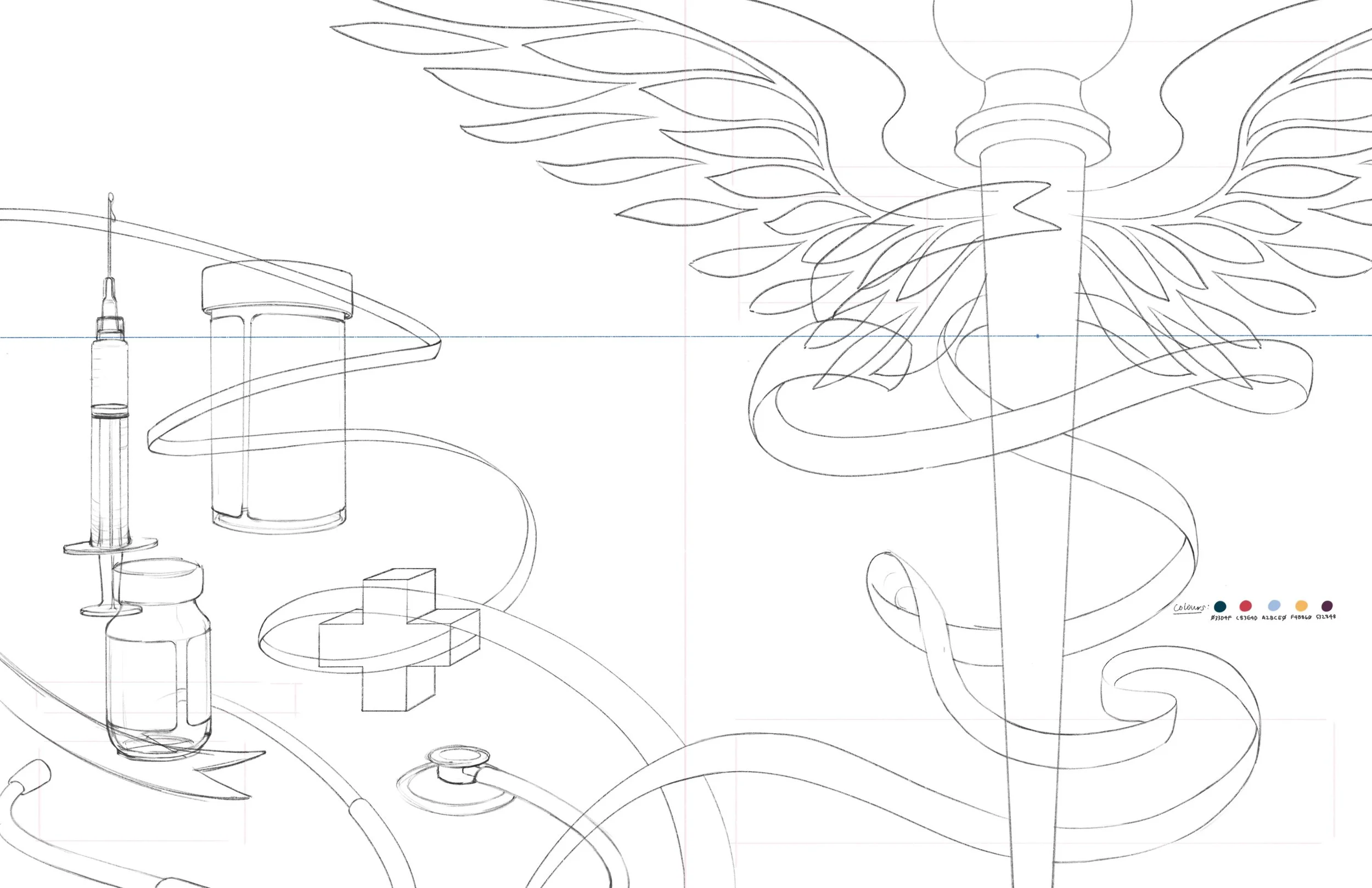
This concept uses a combination of the Caduceus and Rod of Asclepius symbol to represent healthcare via the central staff, twirling ribbons, and silhouetted wings.
Given the imagined environment in which this concept portrays and the abstract nature of this topic, I decided to develop this piece using a graphic, cell-shaded approach for the style to make this layered subject friendly and approachable.
The back cover sketch sees littered prescription medication bottles, vaccines, and other healthcare items in reference to the issue’s featured stories. These elements are tied together by the continuous ribbon from the front side of the cover.
On the front, the ribbons act as the path in which individuals traverse on within this imagined healthcare landscape, as well as the institution they exist in. This allows me to represent different experiences with healthcare through each figure.
Illustration Process